Before
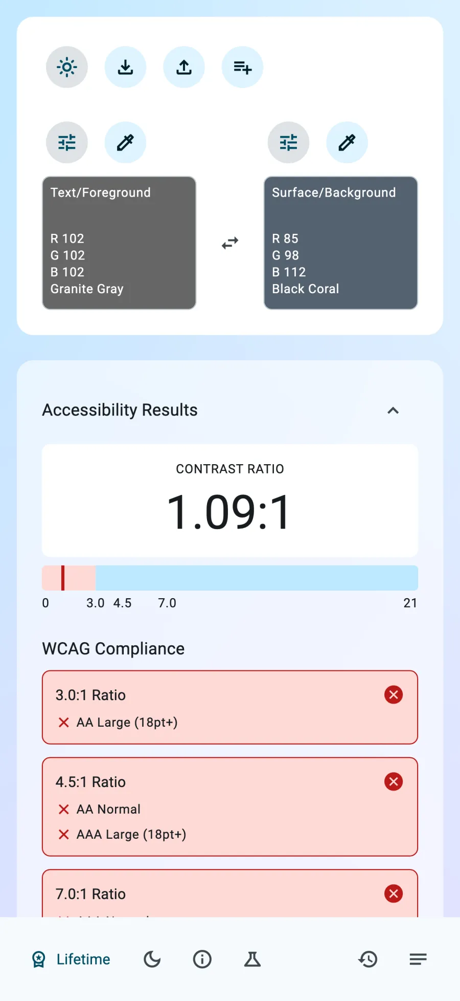
Granite Gray on Black Coral
The pair reads 1.09:1. It misses 3:1, 4.5:1, and 7:1.

Clarity: Color Contrast Check
For designers, developers, and accessibility advocates
Choose text and background colors. See the ratio, AA and AAA results, and suggestions for better contrast.
Free to try. A one-time lifetime purchase to unlock all features.
Available for iPhone, iPad, and Mac.

“Does exactly that it needs to do. Responsive Dev. Must-have for web building, and making sure sites are accessible. Recommended.”
Wacko_66·macOS App Store
The problem
It is hard to judge contrast by eye. Check the text and background colors before you use them in an interface.
Clarity gives you a ratio and a result for each WCAG contrast target. If a pair falls short, review color suggestions and choose one to apply.
What Clarity checks
Clarity checks foreground and background colors with the WCAG 2.0 relative-luminance contrast formula.
It compares the relative luminance of the lighter and darker colors with this formula: (L1 + 0.05) / (L2 + 0.05). L1 is the lighter color's relative luminance. L2 is the darker color's.
The live ratio ranges from 1:1 to 21:1. Results update as you change either color.
An example finding
This pair starts at 1.09:1. Clarity marks every displayed ratio as a fail.
Before
The pair reads 1.09:1. It misses 3:1, 4.5:1, and 7:1.
Suggested alternative
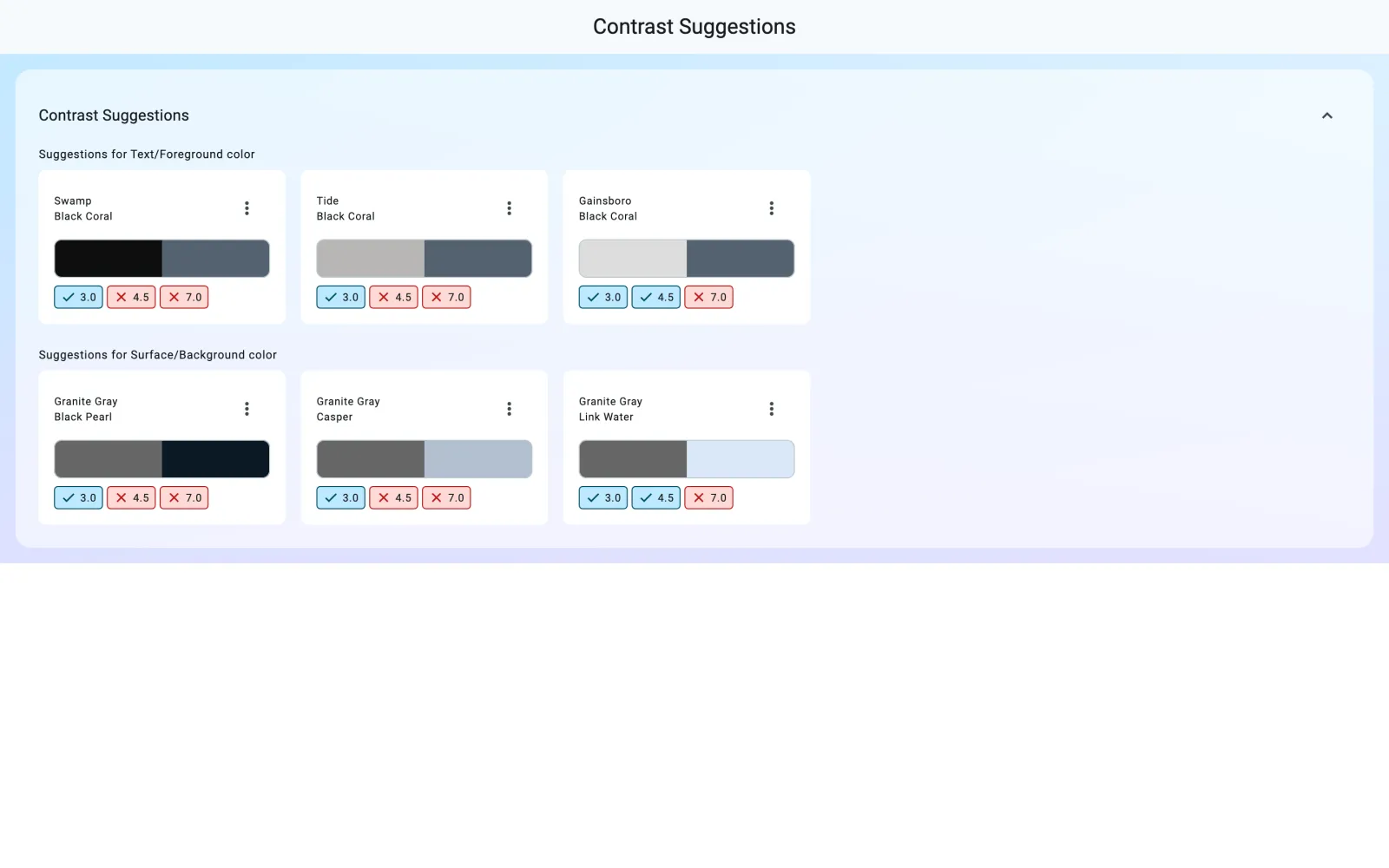
This suggestion meets 4.5:1 for AA normal text. It does not meet 7:1 for AAA normal text.
“Simple but super practical app that’s been a big help while designing interfaces for an upcoming website I’m developing. It instantly shows whether your color choices meet accessibility standards, making it easy to keep everything readable for everyone. Definitely a must-have for designers.”
-Top_Ti3r-·macOS App Store
The workflow
01 · Choose
Adjust colors with RGB, HSL, HCT, LCH, or LAB controls. On Mac, sample a color from your screen.
02 · Check
See how the pair measures against AA and AAA contrast ratios as you edit.
03 · Refine
Try a suggestion, check text readability and color-vision simulations, then save or export the pair.
Try it
Pick a text color and a background. See the real contrast ratio and AA and AAA verdicts.
01 · Text color
02 · Background
03 · Verdict
Near-black on Yellow passes AA and AAA.
Readable starts here
The quick brown fox jumps over the lazy dog.
Try sample pairs here — in the app you can check any colors you pick.
Check your own colors
Free to try. A one-time lifetime purchase to unlock all features.
More ways to review a pair
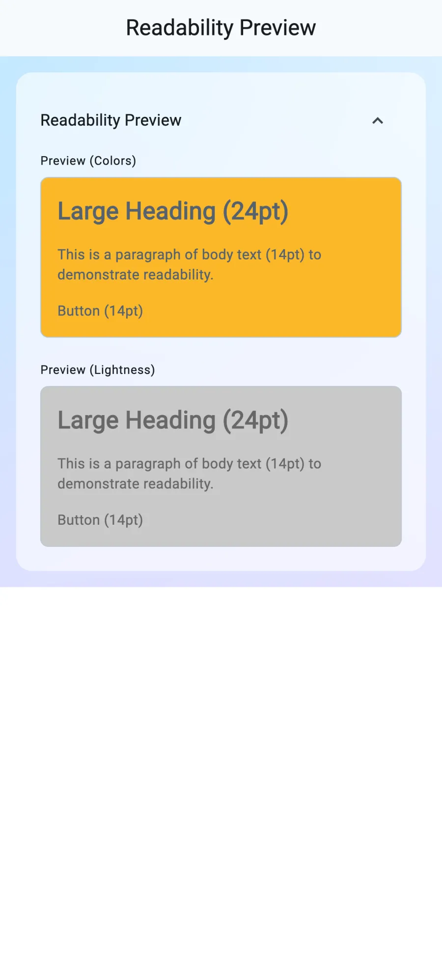
Check headings, body text, and button text against the pair. Compare the colors with a lightness preview, too.
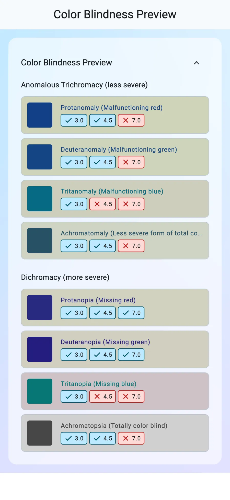
See the pair across eight color-vision simulations. Clarity shows a contrast check for each one.
Import palettes from text, files, or images. Export colors as text, files, or images.
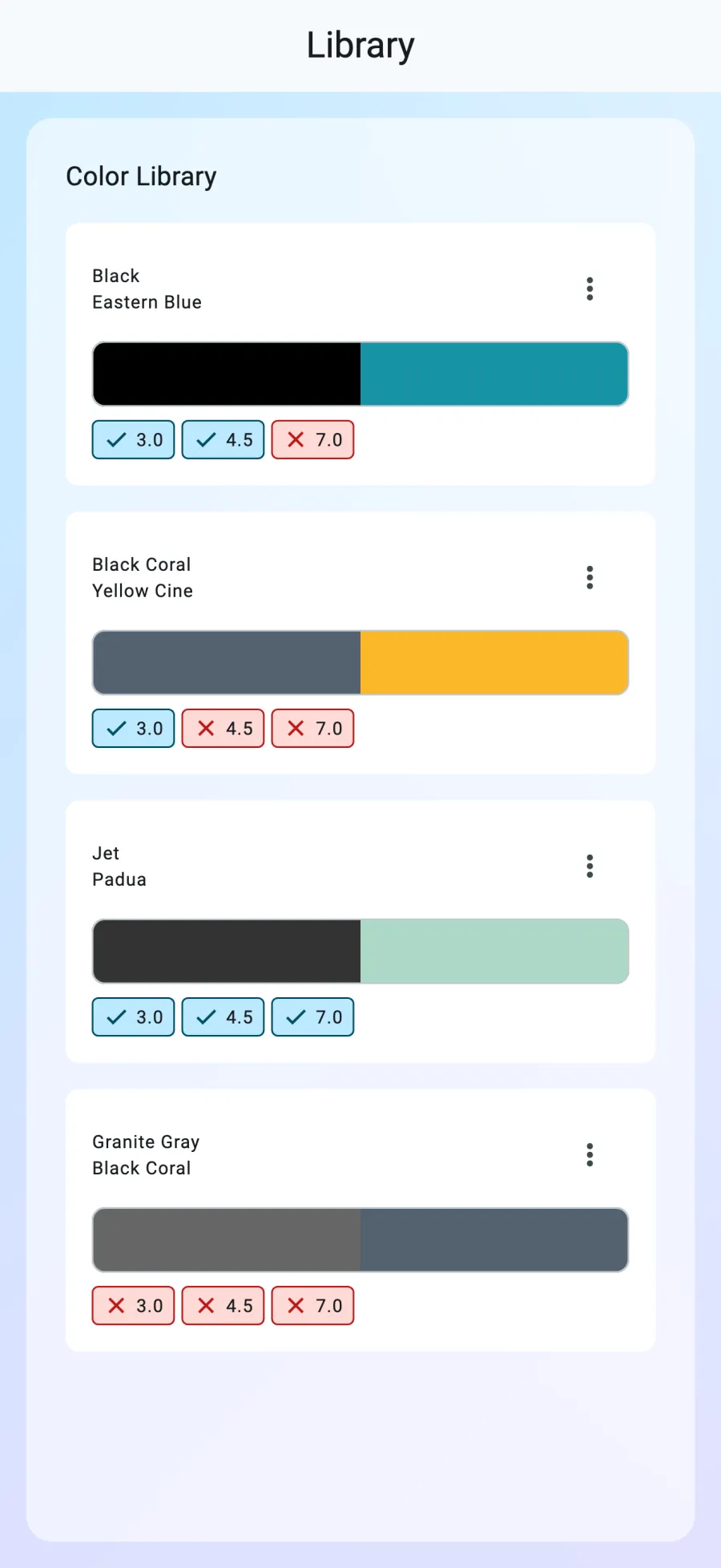
Recents keeps up to 20 pairs automatically. The Library holds pairs you choose to save.
Before you download
Yes. Clarity is free to download and try. A one-time lifetime purchase unlocks all features.
Clarity uses the WCAG 2.0 relative-luminance contrast ratio and shows AA and AAA results.
Clarity suggests alternative colors. You choose which one to apply.
Clarity is available for iPhone, iPad, and Mac.
Check your next color pair
Get Clarity for iPhone, iPad, and Mac.
Free to try. A one-time lifetime purchase to unlock all features.
More apps